New Switch Control in iOS 5
Little changes like this are often overlooked but they represent disproportionately large changes to usability. I see two main changes taking place with the UISwitch, which is the technical name for this view in UIKit.
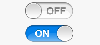
Before the switch was squared off, interactions occurred by either sliding the square nub, or tapping to alternate the state of the control. Now, the nub is rounded, and follows the rest of iOS UI, becoming circular and finger-sized. In the new design, the background colour of the switch is easier seen, as the nub size has become smaller. This is important in non-English languages (determined the device’s locale settings), where the control isn’t labelled with “On” or “Off”, but rather “O” or “I”, like a power switch. By being able to see the highlight colour easier, less mental parsing is required as to the current state of the switch.
To my memory, this change of the UISwitch is the first major change of a UI element in iOS. Gradients and backgrounds have changed slightly around the system, but the change in switch design is much less subtle. I think this is good. It shows Apple is prepared to change things, even in a device population dominated by “newbies”, rather than the geek - who can take on change much easier, as seen in the regular revisions in Mac interface. I had been concerned that Apple was resistant to large change in iOS to maintain simplicity, but this sets my mind at ease.